

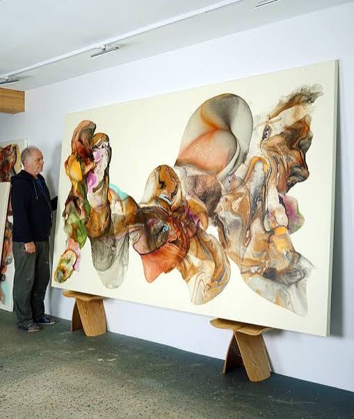
Abstract art is built on the creative relationship between visual elements rather than the accurate representation of recognizable subjects. Artists use shapes, lines, colors, textures, and spaces to create compositions that communicate ideas and emotions. Among these elements, composition and color balance play a particularly important role in determining how an artwork looks, feels, and captures the viewer’s attention.
In an Abstract Oil Painting, composition determines how different elements are arranged across the canvas, while color balance helps establish harmony, contrast, and visual rhythm. When these aspects work together, even an unconventional arrangement of shapes and colors can feel purposeful and engaging. Understanding their relationship offers valuable insight into the artistic decisions behind abstract paintings.
What Is Composition in Abstract Oil Painting?
Composition refers to the organization of visual elements within an artwork. It determines where colors, shapes, lines, and textures appear and how they relate to one another.
Unlike traditional paintings that may use composition to guide attention toward a central subject, abstract art often relies on relationships between multiple visual elements. Artists may create movement through diagonal lines, establish stability through symmetrical arrangements, or introduce tension by placing contrasting shapes close together.
A well-developed composition helps viewers explore the painting without feeling that its elements are randomly distributed. It creates a visual structure while allowing room for experimentation and individual interpretation.
Key Principles of Composition in Abstract Art
Artists use several principles to create compositions that feel balanced, expressive, and visually interesting.
Visual Balance
Visual balance describes how different elements distribute attention across a canvas. It does not always require symmetry. A large, dark shape on one side may be balanced by several smaller, brighter elements on the other.
Abstract artists often use asymmetrical balance to create compositions that feel natural and dynamic while maintaining visual stability.
Movement and Direction
Lines, brushstrokes, and shapes can guide the viewer’s eyes through a painting. Horizontal arrangements may suggest calmness, while diagonal and curved forms can introduce movement.
Artists use directional elements to connect different sections of the composition and prevent the artwork from appearing static.
Emphasis and Focal Points
A focal point is an area that naturally attracts attention. It may be created through a bright color, unusual shape, strong contrast, or concentrated texture.
Not every abstract painting needs one obvious focal point. Some compositions distribute attention across the entire surface, encouraging viewers to explore different areas gradually.
Repetition and Rhythm
Repeating shapes, lines, colors, or marks creates visual connections throughout a painting. These repeated elements establish rhythm and help the composition feel unified.
Artists may repeat similar forms while changing their size, direction, or color to introduce variation without losing consistency.
Negative Space
Negative space refers to areas that contain fewer visual details. These spaces are important because they allow more complex sections to stand out.
Leaving parts of a canvas relatively open can create contrast, improve visual clarity, and give the viewer’s eyes room to rest.
Understanding Color Balance in Abstract Painting
Color balance involves arranging different shades and intensities so that they work together effectively. Artists consider the relationships between warm and cool colors, light and dark tones, and strong and subtle hues.
A painting does not need equal amounts of every color to achieve balance. A small area of an intense shade may provide enough contrast to balance a much larger area of a softer color.
The goal is to create a relationship between colors that supports the composition and the intended visual experience.
How Different Color Relationships Influence Balance
Warm and Cool Colors
Warm colors include red, orange, and yellow, while cool colors include blue, green, and violet. Artists often combine these groups to create contrast and visual variety.
For example, a composition dominated by cool blue tones may use small orange sections to introduce energy and attract attention. This relationship can make the artwork feel more dynamic without requiring an excessive number of colors.
Light and Dark Values
Value refers to how light or dark a color appears. Strong differences in value can establish focal points and create depth.
A dark shape placed against a light background may become immediately noticeable. Conversely, paintings with closely related values often produce a softer and more unified appearance.
Complementary Colors
Complementary colors sit opposite one another on the traditional color wheel. Examples include blue and orange, red and green, and yellow and violet.
When used together, these combinations can create strong visual contrast. Artists often adjust their intensity or proportions to prevent the composition from becoming overwhelming.
Analogous Colors
Analogous colors are located near one another on the color wheel. A combination of blue, blue-green, and green is one example.
These colors often create a harmonious appearance because they share similar visual qualities. Artists may use analogous palettes when they want a composition to feel connected and consistent.
The Relationship Between Composition and Color
Composition and color balance are closely connected. The placement of a color can be just as important as the color itself.
A bright red area may attract attention when positioned near a quiet section of a painting. If the same color is repeated across the canvas, it may instead create rhythm and visual continuity.
Artists consider several relationships when combining these elements:
- Color distribution: Determines how different shades are spread across the canvas.
- Shape and color interaction: Establishes connections between forms and their surrounding areas.
- Contrast placement: Directs attention toward particular sections.
- Repetition: Creates unity through recurring colors and visual patterns.
- Negative space: Prevents strong colors and complex forms from overwhelming the composition.
When these relationships are carefully managed, the painting can feel cohesive without becoming predictable.
Techniques Artists Use to Improve Composition and Color Balance
Abstract painters use different methods to experiment with visual arrangements and refine their compositions.
Layering Colors
Applying multiple layers of oil paint allows artists to develop depth and adjust color relationships gradually. Earlier layers may remain partially visible, adding complexity to the finished surface.
Palette Knife Application
Palette knives create bold shapes, textured marks, and sharp transitions. Artists can use them to introduce strong visual elements or balance smoother sections of a painting.
Color Blocking
Color blocking involves placing distinct areas of color next to one another. It can establish structure, emphasize contrast, and create a clear visual rhythm.
Controlled Brushwork
Brushstrokes can direct attention and connect different parts of the canvas. Broad strokes may establish movement, while smaller marks introduce detail and variation.
Experimentation and Revision
Artists often step back from the canvas to evaluate the overall arrangement. They may adjust the position of shapes, introduce another color, or reduce an area that attracts too much attention.
This process helps them judge the painting as a complete composition rather than focusing only on individual details.
Different Compositional Approaches in Abstract Oil Painting
Abstract artists approach composition in different ways depending on their creative intentions.
Symmetrical composition: Visual elements are arranged in a similar pattern on both sides of an imaginary central line. This can create a sense of order and stability.
Asymmetrical composition: Different shapes and colors are arranged unevenly but remain visually balanced. This approach often feels more spontaneous and energetic.
Radial composition: Elements spread outward from a central point, creating a sense of expansion and movement.
Geometric composition: Shapes such as circles, rectangles, and triangles are organized to establish structure and repetition.
Free-flowing composition: Forms and colors move more organically across the canvas, creating an expressive and less predictable arrangement.
Each approach offers different possibilities for controlling attention and establishing visual character.
Common Mistakes in Composition and Color Balance
Creating an effective abstract painting involves experimentation, but certain problems can make a composition feel less unified.
- Too many competing colors: Excessive color variation can make it difficult for viewers to identify visual relationships.
- Uneven visual weight: Strong shapes or intense colors may dominate one section of the canvas.
- Insufficient negative space: Filling every area with details can make the artwork feel crowded.
- Lack of contrast: Similar colors and values may reduce the visual distinction between different elements.
- Unnecessary repetition: Repeating the same marks without variation can make a composition feel predictable.
- Unclear direction: Poorly arranged lines and shapes may make it difficult for the viewer’s eyes to move naturally through the artwork.
These challenges can often be addressed by simplifying the composition, adjusting color proportions, or introducing more variation.
How to Appreciate Composition and Color Balance as an Art Lover
Viewers do not need formal art training to understand how composition and color contribute to an abstract painting. A few simple observations can make the experience more meaningful.
Start by noticing where your eyes move when you first look at the artwork. Identify the areas that attract the most attention and consider why they stand out. It may be a bright color, a large shape, or an area with thick paint.
Next, observe how colors are distributed. Look for repeated shades, contrasting combinations, and transitions between light and dark areas. Consider whether the painting feels calm, energetic, structured, or spontaneous.
Finally, step back and examine the artwork as a whole. Notice whether the individual elements work together and whether open spaces provide enough visual breathing room.
Applying Composition and Color Balance to Interior Design
The principles of composition and color balance are also useful when selecting abstract artwork for a home or office.
A painting with a strong central focal point can work well on a prominent wall, while a composition with distributed visual elements may suit a wider space. Color choices should also relate to the surrounding interior.
Consider these practical suggestions:
- Choose artwork with colors that complement or thoughtfully contrast with existing furniture and wall finishes.
- Match the painting’s dimensions to the available wall space.
- Use bold compositions as focal points in relatively simple interiors.
- Consider softer palettes for spaces intended to feel relaxed.
- Allow enough surrounding space so the artwork can be appreciated without visual competition.
These considerations help create a connection between the painting and its environment.
Final Thoughts
Composition and color balance are fundamental to the visual success of abstract oil painting. Composition organizes shapes, lines, and spaces, while color relationships establish harmony, contrast, and emotional character. Together, they transform individual artistic elements into a unified visual experience.
Whether an artist prefers geometric arrangements, expressive brushwork, or free-flowing color patterns, thoughtful composition helps communicate creative ideas more effectively. For art lovers exploring different abstract styles, ARTLAND offers an opportunity to appreciate how color, structure, and artistic expression come together in distinctive oil paintings.
